Rt’s post about fun ways to garner more energy from the maw of waste led me to recycle a post from way back here is a fun little graphic.
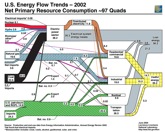
This image and the massive amounts of data that went into making this sweet chart is from The Lawernce Livermore National Lab’s Energy Flow Trends.