Rt’s post about fun ways to garner more energy from the maw of waste led me to recycle a post from way back here is a fun little graphic.
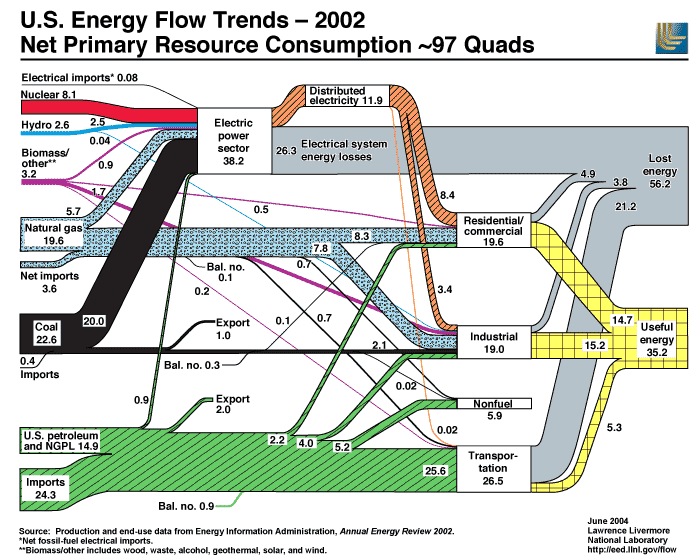
This image and the massive amounts of data that went into making this sweet chart is from The Lawernce Livermore National Lab’s Energy Flow Trends.
I have read some egregious estimates of the poor efficiency in our power distribution system – so bad I won’t even repeat them.
That’s one of the alleged benefits of distributed power. If you don’t ship it so far then there is less waste – a reasonable argument.
There are ways to think smart, but how many will?
Speaking of which, conservation is ABSOLUTELY the best form of energy use.
It would be great if you would link to where you found it:
http://www.treehugger.com/files/2007/01/efficiency_cruc.php
Well jack I didnt find it there, but its good to know that i am not the only one that things this is a cool chart. If you read the post you will see that this is a re-post of an old blog post i made in 2006 in may, so maybe tree hugger got it from me?
I was introduced to this chart when I was working for a renewable energy education group in 2005. The chart itself is from 2002.
So I did in fact link to where I found it. Thanks.
I’m glad you asked Jack. I hate when I don’t quote sources but when I don’t trust the data I really hate giving it more exposure so it’s kind of a hate – hate relationship.
I did some digging to see if I could find a page that looked like the one I read – no luck. It did look similar to the treehugger link you mention, and I do read treehugger, but I don’t think that’s it. This site (probably a different blog) said (as I remember) something about two thirds being wasted. I thought they were talking about transmission losses and decided that was absurd.
In my search to answer your question I could not find any refernces to the overall efficiency of the grid. Nowhere did anyone (other than this LLNL report) hazard a guess as to the efficiency of the grid. Ergo, I decided to check-out the report to see what they did say. There it is, the two thirds number. Everything below is from page 11 (on my Reader) at:
http://eed.llnl.gov/flow/pdf/ucrl-id-129990-01.pdf
“For electricity generation, the electrical system energy losses are assumed by the EIA to be about two-thirds of the energy consumed.”
But wait, it says “assumed” – oh great, this bears further investigation.
“Transmission and distribution losses, which are not spelled out separately on this chart, are estimated to be about 9% of the gross generation of electricity.”
That sounds more reasonable to me. The statement I read wasn’t wrong, I was just getting my exercise leaping to conclusions. But what about these numbers anyway.
So where is that other 57 percent coming from? Turns out they are talking about the efficiancy of EVERYTHING! They are talking about the energy in the fuel compare to the energy “usefully” used (see the part about motor vs. heater efficiency).
“Most of these losses occur at steam-electric power plants (conventional and nuclear) in the conversion of heat energy into mechanical energy to turn electric generators.”
But wait, they are also talking about the devices that use the power (remember this is a VERY top level look – they even cover gas and diesel vehicles).
“For the residential/commercial sector, we again assume an efficiency of 75%. This is a weighted average between space heating at approximately 60% efficiency and motors and other electrical uses at about 90% efficiency. For the industrial sector, we continue to assume a conversion efficiency of 80%”
Oh yay, they “continue to assume”. I’m getting a sinking feeling about this whole report. Here’s the assumption on vehicles:
“For transportation, we continue to assume a generous 20% efficiency, which corresponds to the approximate average efficiency of internal combustion engines as measured on Federal Driving Schedules”
Does that include the new electric/hybrid vehicles? When are they going to update these assumptions?
“for the sake of consistancy” – how about for the sake of accuracy. Not everyone is a liberal arts major you know.
“For the sake of consistency with LLNL’s previous energy flow charts, the U.S. chart for 2001 assumes the same conversion efficiencies for the residential/commercial, industrial, and transportation sectors as in previous years.”
The LLNL isn’trying to lie about it.
“The uncertainties in these conversion estimates are large.”
I just wish the people “reporting” this stuff would understand this stuff. My original statement still stands – conservation is the most effective solution. Changing fuels isn’t going to make a steam turbine any more efficient – fuel cells, that’s another matter.
Rt, that was an amazing and very detailed follow up, but what Jack was really doing was being snarky. His comment was meant to imply that I had somehow “stolen” the idea for this post from treehugger and that I should have given credit to them for it.
Even though the most shallow look at the post shows the link to the post I made about this chart almost a year before treehugger did, the dates are in the links for Pete’s sake. People get very heated about this sort of thing in the blogging world.
Interestingly, the chart is so old I would consider it a historical reference more than news.
This reminds me of the reference to liars and figures. I think it was Mark Twain.
Given the broad assumptions used I’m not sure what I would consider this report.