Get the full pdf of this map here.
For a tonne more great info about this image see the Guardian article here. (check out the interactive table half way down for some really good info).
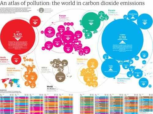
Basically industrialized countries emissions are going down, as places like China’s are going up. This isn’t so much that the US is getting cleaner, just that it has moved its dirty business some place else. China is just the factory that takes the order, the real problem is still the massive consumption and poor planning of the bigger countries. Plus places like the US have historically emitted almost all of the carbon emissions, so the fact that we are reducing our emissions means little when taken historically.
This image is great because it shows just how complicated and interconnected these sort of problems are. There is no longer an us and them, its all “we” now.
